After initial public consultation and stakeholder input, Stempski Kelly Associates have put together a few design options and examples of what Huntsville’s wayfinding signage could look like and the Town of Huntsville would like your feedback.
The goal of the wayfinding strategy is to develop community signage that helps guide people through our community to places of interest or importance, enhancing their understanding and experience.
This signage system will assist individuals in simplifying their routes around Huntsville, helping them get to their desired destinations as easily as possible.
What should Huntsville’s wayfinding signage look like? What graphic elements and hardware designs do you prefer?
Residents are encouraged to participate in the process by completing the Community Wayfinding Strategy Survey on myhuntsville.ca, or sign up to get updates on the process.
For more information please contact Scott Ovell, Economic Development Officer for the Town of Huntsville at 705-789-1751 ext. 3035 or [email protected].
Don’t miss out on Doppler!
Sign up here to receive our email digest with links to our most recent stories.
Local news in your inbox so you don’t miss anything!
Click here to support local news
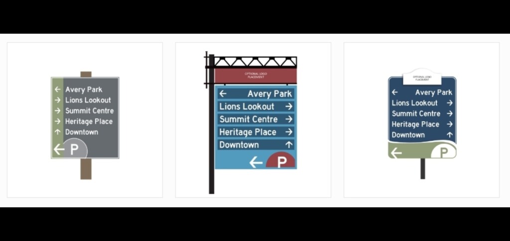
Signs should be simple with good contrast, sans serif lettering and nothing that would clutter the sign which might distract a person. Number 2 should have a darker background for contrast and could lose the fancy ironwork at the top. Number 3 wins my vote, with good contrast, and simple with no distractions. The lettering design on both is perfect. I would hope that the consultants referred to the Town’s new signage policy for guidance.
If the town is going to send folks up Young St and across Town Line Rd West – (as I read the signs ) then the OPP needs to start tagging speeders. In the many years I have lived on Town Line and watched as folks are driving way over the limit ~ I have never once seen an OPP monitoring. And the strange thing is 2 OPP Officers live on Town Line.
Can’t believe how many people are interested in signage! That’s great. But what’s the odds there will be complaints, no matter which sign or variation thereof is chosen. And most vociferously by those who were mute when their input was requested.
I like the middle sign although the directional arrows could be more outstanding.
Glasses you know. Glasses and potholes make the arrows difficult to spot.
I am not sure if the photos are ‘equal’ in size. If they are then middle however if they are not then the one on the right is most clear and simple.
We both like the centre one as it is easier to read.
The Centre One…. I agree with Ray Vowels
Like the centre sign. I agree, it could be bit bigger for reasons already mentioned
I would definitely not choose the one on the left with the arrows all on the same side, because the arrows on the side where you are going I believe are clearer.
I think very white on very dark or very black on very white is easier to see (especially when driving). The colours on the centre one are pretty BUT when driving for safety the white on dark is clearer, so I go with the one on the right. Only thing, I would put the arrow and also the P sign on the left (the direction of it) and again not on this wishy washy pale green but possibly a dark red P on white or some similar idea.
Thanks for the opportunity to put in my 2 cents worth !
At first glance I preferred the middle sign. But after a looking closer I think the right hand sign is better…RRnR
I find the third one easiest to read. I would like to see the white part on the top removed though as it is distracting.. It’s not as pretty as the second one but I find it too busy. It pulls my eyes all over the sign. By the time I got focused I’d be past the sign. The first one is plain enough but the colour is a little dull to show the white letters well. Plus I feel the arrows should come after the lettering rather than before. My eyes begin reading from the left, therefore on the last one I see where I want to go first then I can quickly see the crisp white arrows against a dark blue backing that show me the way to go.
This is one person’s opinion, for what it’s worth.
Me
I agree with Ray….second one ….
I too like the centre one, mind you I cannot read what is shown at the top of the sign.
Good time to again comment on the number of unwanted signs that keep appearing at the side of our roads, fastened to trees, hydro poles etc..
The centre one gets our vote. It’s bolder. Red draws the eye. The two blue shades, dark over light, define the boxes while the white letters, which are larger than the other examples, are much easier to read & stand out well. The name & arrow are inside a box boundary which is easier to discern visually from afar. The differing arrows for direction appear at opposite ends also making it easier to read & make a quick decision while driving. The ‘P’ placed in the red is also effective as it is one of the first things visitors look for when arriving from out of town.
I prefer the middle sign also. It is the easiest to read and stands out better
I like the center one the best seems to me it is easier to read but could be bigger. Most signs are hard to read while driving so should be in a place that is easy to see from a distance to often you have to be almost up to street signs before you can see them.